
· By Ilham Herry
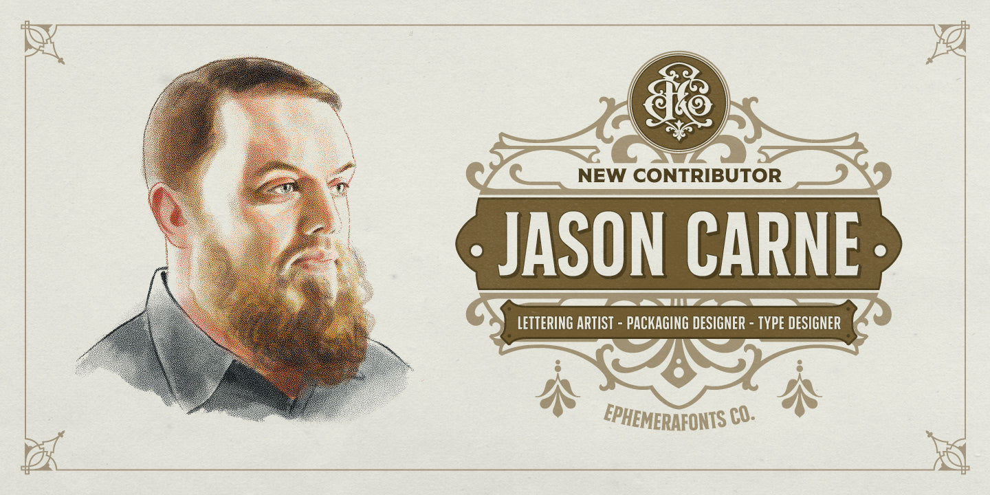
Interview - Jason Carne

If you've jumped into the lettering and typography industry in this digital era, we believe this man will always pop out in your learning process. And in this early of 2021, we are truly blessed with his decision in joining the bandwagon of Ephemera Fonts Contributors.
Without any further ado, let's jump into the conversation with the mighty Jason Carne. Jason Carne is a letterer and designer with a huge passion for creating beautiful, vintage style type. He runs the useful subscription service Lettering Library, and just recently opened up a type foundry with Drew Melton called Carmel Type Co. He is currently located in Pennsylvania working from home with his wife, Melissa, and his dog, Raven.
- Hello Jason, we feel like we've known you for such a long time. The pleasure is ours when knowing your decision in joining the Ephemera Fonts. A little internal story, we're known your name since the Emptees era. How it's going back then?
Wow, that's a serious throwback, sometimes I forget just how long we've been following each other. For those that don't know, Emptees was this rare hotbed of raw talent in its prime that focused specifically on t-shirts and apparel design (kind of like Gigposters.com but for band merch and indie clothing brands). Many of the best illustrators and band merch designers I know all started on Emptees (and then Mintees when Rob Dobi and company took the reins when they decided to close up shop). That place was like a trial by fire, if your designs were wack they told you which made you quickly level up if you had thick enough skin. Back then I had gotten to a point where I was pretty much strictly designing band shirts and I was doing a lot of work for the majors like Live Nation, Bravado, Universal, and Warner, but it was always the most fun when bands approached me personally to do their work.

- How's the early story about the transition of your pivot to the lettering industry?
When I was a kid I would draw metal band logos all over my notebooks in school or write graffiti wherever I could, but at that time I never really knew it was something I could do as a career or make money off of. When I first started out as a graphic designer back around 2007 it was mostly just for bands my friends were in - I did a lot of flyer designs for local punk/hardcore/metal shows, LP/EP/demo covers, band merch, etc. I realized eventually that I enjoyed doing the lettering more than the visuals at some point and it became an all out obsession to the point where I was doing nothing but lettering - for years I rarely included graphics at all outside of ornamental swashes or decorations.
- Your name is getting bigger in this industry, let's talk about the Lettering Library project. You are opening the gate of history and reference to the internet fellas. How does it start?
Years ago I was invited by friend Mike Jones to speak at his event called Creative South which is this great design conference down in Columbus, Georgia. Being that it was my first speaking gig I wanted to have a partner with me on stage in case I totally dropped the ball and froze or couldn't remember what I wanted to say, so I reached out to Keith Tatum, who many of you may know as "The Type Hunter". We were both into collecting old ephemera, books, signs, and packaging, and I saw the direct benefit of what Keith was doing in the design community as he posted his seemingly endless stream of amazing sources of inspiration and reference on his feed. I saw that his posts were influencing and informing a new generation of artists the old ways of doing things and showing them that craftsmanship and attention to detail was important - and that kind of lit the bulb in my head for the Lettering Library. I had this ever growing personal library of books on sign painting, show cards, penmanship, monograms, alphabets, and ornamentation that were just sitting on my shelves, only being used by me. It felt a little selfish to hoard all of this knowledge, so I began to offer PDF's of these books to the design world in hopes that it would help others learn lettering the way that I did or that it would spark some inspiration in someone else.

- Your diversion move in the industry of letters are limitless, we can feel the passion in it by looking at your movement. Typeface designing, Carmel Type, tell us the story behind it?
Lettering is less of an occupation and more of an obsession for me. I think about them all day long, even when I'm not drawing or making them - the same way a song might get stuck in someone's head. Carmel Type Co. came about because I had some of these letter styles in my head that weren't necessarily right for the commissioned work I was getting, but I felt that they could be useful alphabets and letter styles for others possibly (or even myself on future projects). I feel like I'm able to keep my fonts up to a certain quality because I'm always making what I want to make, so I stay passionate about it until the end. I've never designed a font with the mindset of "this what the market wants right now". If it's not cool, if it's not a letter style I would personally use, I don't see the point in spending time on it.
- This could be the highlighted milestone in ours, how did you know Ephemera Fonts?
I've been following each of you individually for a long time, and your work was always impressive in its own right, but when you all came together and I saw what you were doing as a collective unit that's when it became truly special. I remember being blown away by the imagery you were creating when you first launched Ephemera Fonts and thinking "this is exactly what I wish Lettering Library and Carmel Type Co. could've looked like", but I didn't have the bandwidth (or ability) to do it like you guys have done. You each bring something to the table and compliment one another's skill sets so well that it's like a designer's all-star team.
- And what finally make decided you to join us?
When Drew Melton and I began Carmel Type Co. back in 2015 there weren't many boutique font foundries out there that were specializing in vintage letter styles. Since then, there have been a handful of great foundries pop up in this same realm, but none have been doing it better than Ephemera Fonts - every font and graphic feels like a truly authentic representation of the era it was inspired by. The attention to detail your crew has is unparalleled in the display type world and I can't imagine a better group of artists to collaborate with.

- Let's jump in deeper, (since we known that you're a night owl person) what makes you stay awake at night lately?
I've always been a night owl, but I rarely do actual work at night nowadays. Typically I'm listening to records or watching a movie or TV series with my wife Melissa. Lately I've started playing guitar again a bit, but I've definitely gotten rusty.
- What inspires you the most in every single work of yours?
Improvement. I'm just hoping that I learn a new trick or skill every time I create something new that helps me be more efficient or better at what I do. I'm also really inspired by the work of my peers and I feel the need to keep up and stay sharp to be able to compete.
- After all of Jason Carne's things till today, what does lettering means to you?
I'm not really sure what it means to me to be honest, but I think I know why I enjoy it on a psychological level. You can letter the same word a million different ways and have it evoke just as many different emotions or connotations, so there's a certain power in being able to harness and control that and being able to bring clarity to ambiguity. Lettering is about successfully delivering a message on multiple levels - sure, you're communicating to the viewer in a very literal sense, but you're also adding another layer of complexity and nuance with how you style that communication. Good lettering bridges the gap between a message and an emotion, and when you get it just right it's extremely satisfying.

- Any resolutions or upcoming projects that you working on for this 2021
I don't know if I'll be able to stick to it, but in 2021 I'm trying to make one font a month, every month. It's a bit daunting, and freelance work might throw me off track, but I have so many font ideas in my head that I want to bring to life and I'm going to try to hold myself to it.
Check out Jason Carne latest font release


